The web was never designed as a desktop system.
The web was designed as a place for information, not a place for applications and user data. Yet that is what it is becoming.
The move of the web from informational to functional is not a bad thing. It has many advantages. Users no longer have to act like the system administrators of their own computer. Things will just work. If ever something doesn’t work, you just poke the device reset button with a ballpoint pen. The general purpose computer will be almost as usable as an iPad.
We should however be careful that we implement the changes that are necessary for our web of information to become a web of software. One important thing to fix, as the inventor of the www points out is separating power over an application’s functionality from power over each user’s data.
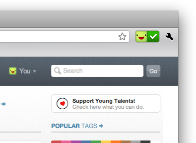
The web started as just hypertext. Text, and links to more text. Some embedded photos maybe. The big kickoff was Netscape’s revolutionary browser. At the top, it had a back button, a forward button and a ‘home’ button to take you back to your ‘home page’. Then the address bar, and it was all you needed. After all, this was like a document browser.
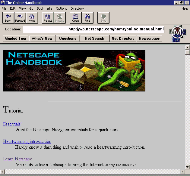
Early Netscape Navigator: A big ‘home page’ button, no SSL padlock yet, and no search box. Source: wikipedia
When the web was still hypertext home pages
You always started on your own home page. The web was only used by computer science researchers, so usually your home page would be a small photo, your name, links to the department you work at, your publications, and some ‘links to interesting stuff’ (#FF’s ancient predecessor) and maybe some ‘fun links’ at the bottom. From your home page, you clicked one of your own links, on your own home page, to move around to other home pages and web sites, maybe you used the back and forth buttons, and when it was time to go home, you would click the home button. It made a lot of sense as a user interface for the hypertext web.
When the web was about “.com” e-commerce
Then, some of these static webpages became dynamic. This was big news. Some of us remember when being ‘interactive’ was the coolest thing a website could have - cgi-bins and dhtml were everywhere. I imagine it must have been a bit like this for our parents when normal television became colour television. Suddenly, you could use the web to buy stuff. Suddenly, the user interface was no longer sufficient. Because for e-commerce, you need https, and the padlock was introduced. The padlock started out on the bottom right, but as it became more important, it made its way to the address bar.
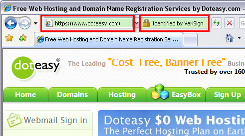
E-commerce made the SSL padlock more important than the ‘home’ button. Source: doteasy.com
At the same time, people started using portals instead of their own home page, so that they didn’t have to maintain their own ‘interesting links’ and ‘fun links’ sections on their home pages anymore. Professional home page composers created something like a table of contents, which you could use instead of your own home page. When this job was automated, ‘table of contents’ slowly became ‘keywords index’, as the portals evolved into search engine.
Search replaces the ‘home’ button
It took a while for the user interface to catch up with the rise of search engines. For portals, the ‘home page’ button could be rebranded as a ‘home’ button, be that home your own home page or a portal, it still makes sense to go there with a home button, and then use that home page as any other hypertext document. But for the keyword index provided by search engines, it makes more sense if the browser bar provides a search box.
So instead of typing an address into the address bar, you type a keyword into the search box. It is interesting to see how this user interface change (like the addition and evolution of the SSL padlock) is a reflection of how people are using the web.
Firefox 2 had a the search box very present, but also still the ‘home’ button.
So now the web was basically hypertext plus e-commerce plus search. Many people didn’t even have a home page anymore, and the web was no longer a hands-on game. That’s not a bad thing in itself, if the web provides generic information about things like museum opening times. I don’t remember exactly, but I think we used to use a big paper phone book and then a voice call to a live museum employee before the web existed. I mean, this was great progress.
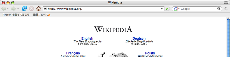
This is where the web becomes a place to consume rather than to exchange information. Information and goods were offered by museums and shops (servers that serve clients), and it was consumed by users (clients served by servers). Nowadays, some browser have merged the address bar and the search box into one ‘where i want to go’ bar. And I suddenly noticed something else the other day: The big button with the house on it? No longer there.
How do I get back to my personal ‘home page’ now? Source: flickr
Then it started to go wrong, as we all know.
The people wanted to contribute again, have home pages again. Two really new exciting things were invented: the blogosphere, where you can not only read but also write on the web, and the concept of the web being a “social” place. Of course, it was just the web resetting itself back to its original version, when the ‘home page’ button would still take you to your home page.
This move back to the original concept of home pages (both in the sense of ‘blog’ and in the sense of ‘profile page’) was a good thing. With all our excitement about the huge amounts of generic information being unlocked (I remember when it became a realistic option to not have an encyclopedia at home), and mainstream commerce moving to the web, the ‘home page’ aspect had moved to the background.
What was not so good was the way it was implemented the second time round: as user-contributed content on commercially owned websites. This is wrong, because the user should always own and control her own content. Luckily, since a year or so, there are more and more projects trying to fix that bug in the web’s current architecture. Unhosted is one such non-profit project that incidentally starts its first donations campaign next month (subtle hint! ;).
If the web becomes the desktop, then where’s my desktop user session?
This time round, home pages are interactive. They are no longer just hypertext, they are user profiles for online applications. A bit like the ‘My Documents’ directory on Windows. When you log in to a desktop system, the very first thing you do when you sit down at the keyboard, is type in your user name and password to start a desktop session.
Your desktop session opens up access to your local files. Whichever installed software applications you use on your computer, they always access your ‘My Documents’ files, as well as your custom user preferences, thanks to you already being logged in to the operating system. It is not necessary to log in to each application separately. Ever thought of that?
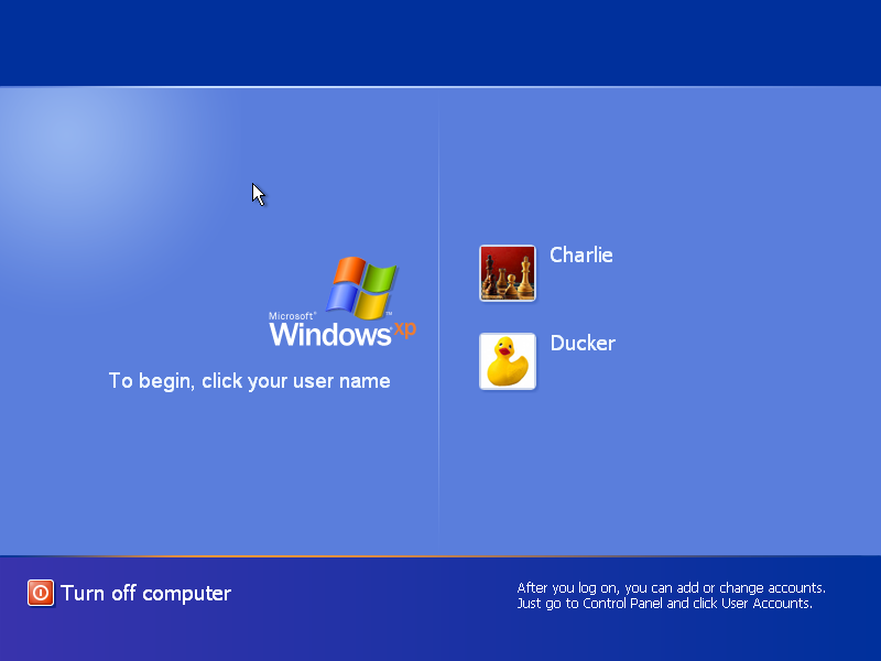
Windows login screen. source: yoyogames
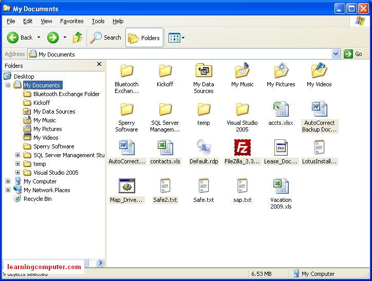
I’m logged in as me, so I can see My documents. Source learningcomputer
Now that the desktop is moving into the browser, we need to move the concept of ‘desktop session’ into the browser as well. It would be too cumbersome, and also unnecessary, to type in your password for each application you open. On the web, this concept has been called ‘single sign-on’, and we’re having some trouble getting it right.
Single sign-on
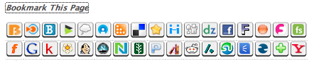
There is OpenId, which is a good start. It suffers from the nascar problem though: because OpenId is an open standard, there can be no a priori assumption about which provider you will use to log in. You must therefore log in to each website with the correct identity provider, meaning that everytime you open a web application, it starts with searching for your provider in a what looks like a nascar of logos.

Logo overload in nascar racing. source: sportydesktops
Similar logo overload in the web’s current identity-mechanism crisis. Source: itickr
The nascar problem, as well as OpenId’s ‘web site address vs web user address’ confusion, is solved by WebFinger (aka the Hammer stack). Now, instead of saying ‘log in with your OpenId by clicking on one of these logos’, a website can say ‘log in with WebFinger by typing in your email address’. Then, in a pop-up, you have to click ‘yes’. Why? Because this is all built on just web pages. The login screen of web applications can become pretty easy now. Especially if you store passwords and cookies in the browser, your browser builds up some state about you. That makes it easier to browse the web from home than it is from an internet cafe.
But come on, why does this login business need to be so hard for the user? When we used installed desktop applications, there was no need to tell each application who I am when I open it, and then in a separate pop-up confirm again if I am really OK with opening the application. Of course the application knows that I’m me, I’m logged in to the bloody computer. No wonder users and websites succumb to mordor if what the web itself is offering is so clicky, popuppy, and generally crappy.
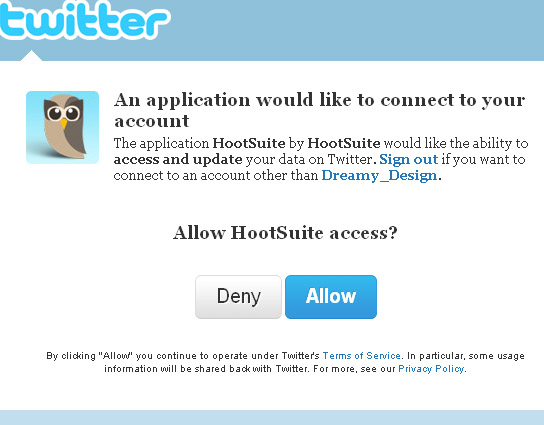
The future of UX is our old friends, the pop-ups! Source: strategiconlinemarketing

Mordor creeping up on even more user data. That’s right, I compared “Facebook Connect” to Mordor. Source: cnet
Logging in to the browser
The reason I told you the whole story about how the home page button disappeared, the padlock appeared, and the address bar became a search box, is to illustrate that browser UX should follow our usage patterns. Nowadays, we want to use the web as a software platform that we log in to, just like we log in to our operating system. That makes much more sense than each application splashing us its own login screen. Once you realise that, it’s easy to see how this would work. When I open up my browser, I do not have a ‘home page’ button. I have a ‘current user’ button. This is what logging in could look like:
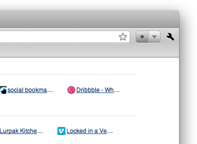
Logged out. Click to log into your browser, optionally using the dropdown.
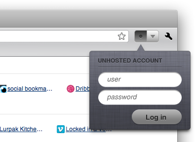
Logging in to your browser. Why did we not think of this before?
Look mum, no login screens!
This login would send the password I typed to my identity provider, and if the password’s correct, I’m now logged in with that identity. Let’s not send this identity by default to each website I visit. Even though the web is now my desktop, it is a very open-ended desktop, where not each application should be considered ‘installed and trusted’. Also, if I’m only reading wikipedia, there is no need to log in. As soon as I get to an action that requires me to identify myself, the identity button would change colour, to highlight the fact that I’m not logged in to the current website. I click the icon once to log in to the current website. I click it again to log out. Log in, log out.
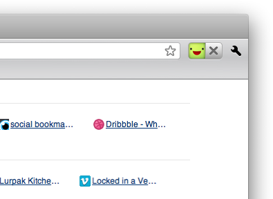
Logged in as @edokoa in the browser now, ready to use that identity as needed.
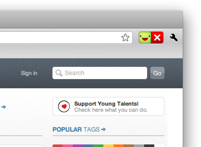
Login required here, please click me once
Logged in here, click to log out
This gets even more useful if you add easy switching of identity. Managing multiple identities online is much more important than managing multiple desktop users offline, so I would like to have roughly three usernames instead of one. The reason people have only one online identity right now, is that it is so hard to switch all the time. I notice that I never tweet as @michielbdejong anymore, since I’m logged in as @unhosted all day, and switching is a hassle. If switching between nicks would be a two-click action (one to show a list of avatars, and a second click to set the current one), then it would be a lot easier to keep separate stuff separate.
Technical details brainstorm
The hard part would be to get both FireFox and Chrome to say “Yes, let’s fix this blatant UX caveat.” If they do, then the easy part is the implementation that would make this possible. I would personally propose WebFinger + OAuth2-cs + OpenId for the communication between browser and identity provider, I think, although many people who may be reading this will probably have a better idea about this. Once my browser knows who I am, we could use the Verified Email Protocol for the communication between browser and web application.
Let’s not use asymmetric cryptography this time. That’s for authorizing devices, not users. Users should not build up state in their browsers. It might make my experience better on my own laptop, but then when I go to an internet cafe, or click my device’s ‘reset’ button with my ballpoint pen, my experience would be crappy again, and sooner or later I would succumb to Facebook Connect.
I think we can do a little three-step trick: take the master password the user types, and derive two short hashes from it, with roughly 8 bits of entropy each. Send one to the identity provider, and get a longer hash back from there. Use that longer hash together with the second short hash and the URL of the application, to derive the actual login for it.
This way, the identity provider and the application provider each get to see only half your master password. Because the other password is still 8 bits, they would only have (I think, crypto experts please confirm this) a 1.2% chance of guessing the entire master password in 3 tries.
I want a browser that can do this
Whatever the implementation details (the ones I’m giving here are brainstorm ideas), I think the main message is clear: Throughout the decades, browsers saw the ‘homepage’ button disappear as the web grew more generic. They saw ssl padlocks arrive as e-commerce started. And they saw search boxes arrive as portals went from being this global book’s “table of contents” to being its “keyword index.” This year, the cloud is slowly becoming our new desktop. Next year, my browser should have a new UI element: to choose, see, and switch the current desktop user session.
EDIT: you should also read @azaaza’s post about exactly the same topic.